#TidyTuesday contributions ~2020-2021
The #TidyTuesday R community social project is a weekly challenge to create data visualizations from pre-processed data and share products and code with community members (often with the hashtag #TidyTuesday). I credit this project and it’s participants for much of my early development as an R coder.
Between 2020 and 2021, I participated regularly in the community project; In doing so, I learned several new technmiques (text processing, data scraping from APIs, animating plots, creating custom geoms, to name a few), and developed better understanding for the principles of data vis. Here are a few of my favorite contributions.
As code-sharing is a key aspect of the project, the code for all of the following plots (and more) can be found on my GitHub.
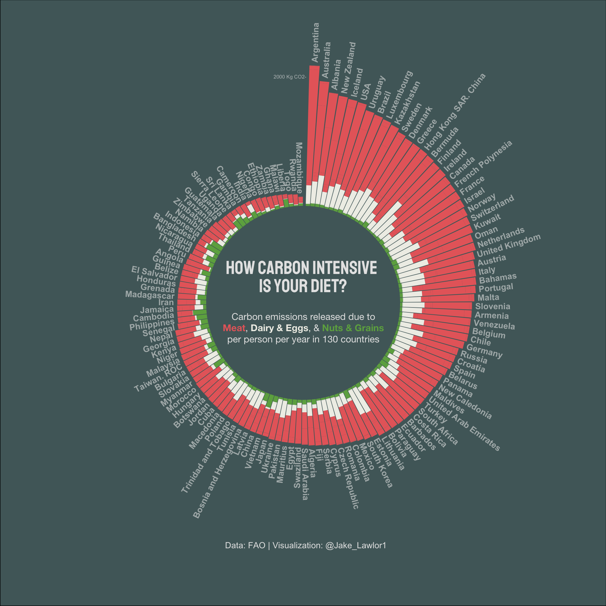
CO2 in Food (pictured above)
Average carbon emissions from elements of the diets of nearly 180 countries around the world.
Spotify Playlist Traits
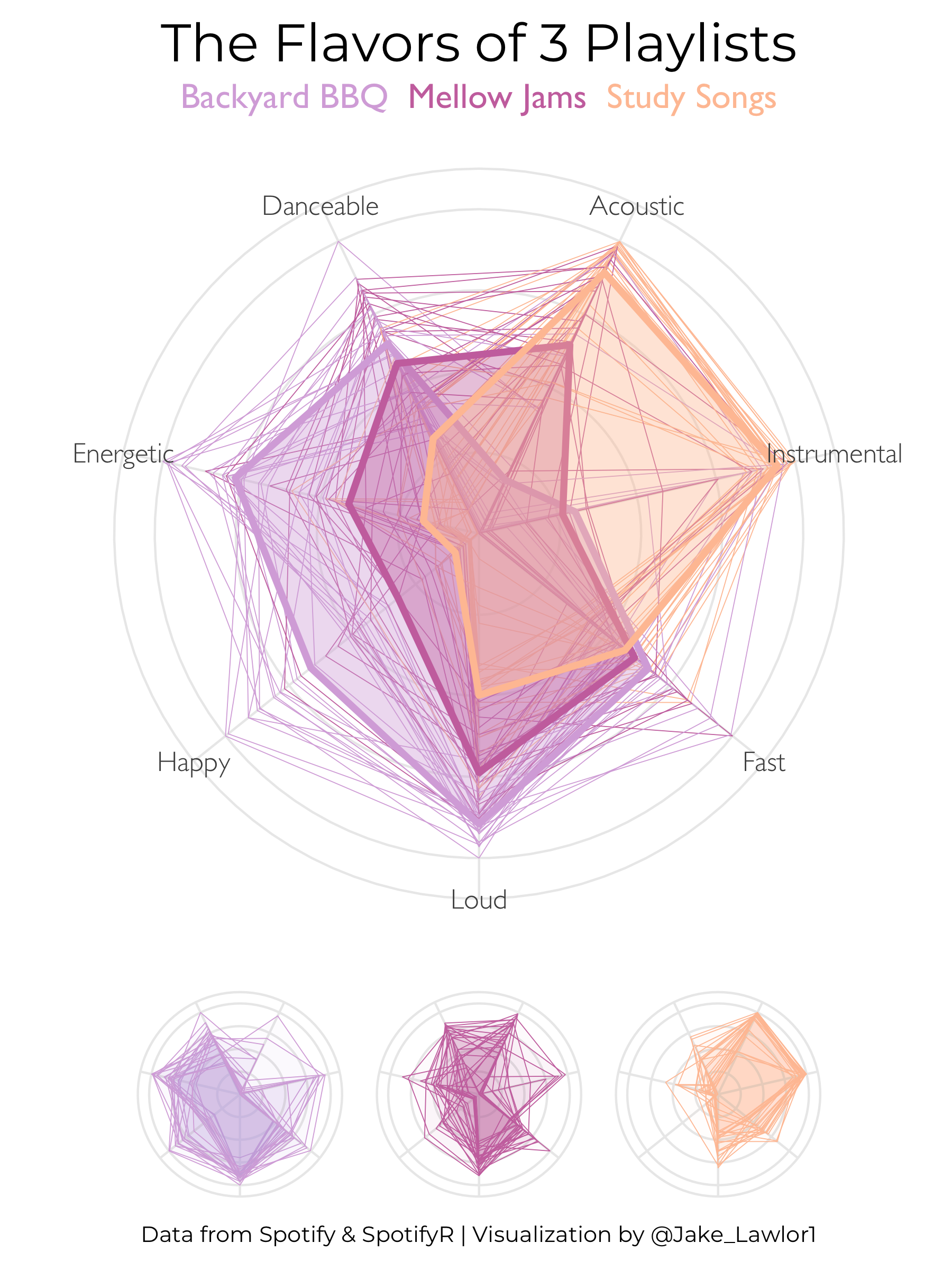 Average qualities (or “traits”) of songs within three of my own spotify playlists. Here, I used the
 spotifyr API package to mine data from my own playlists, and a polar web plot to visualiza sonic characteristics of individual songs and playlist averages.
American Worker Wages
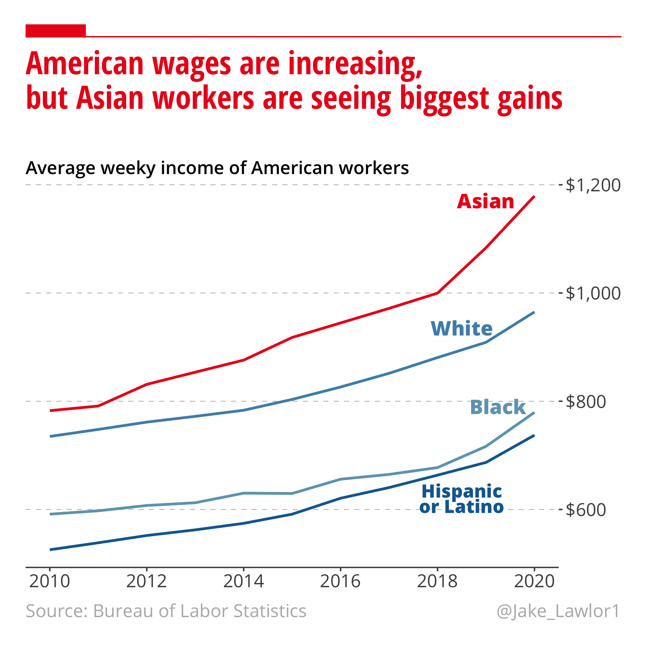
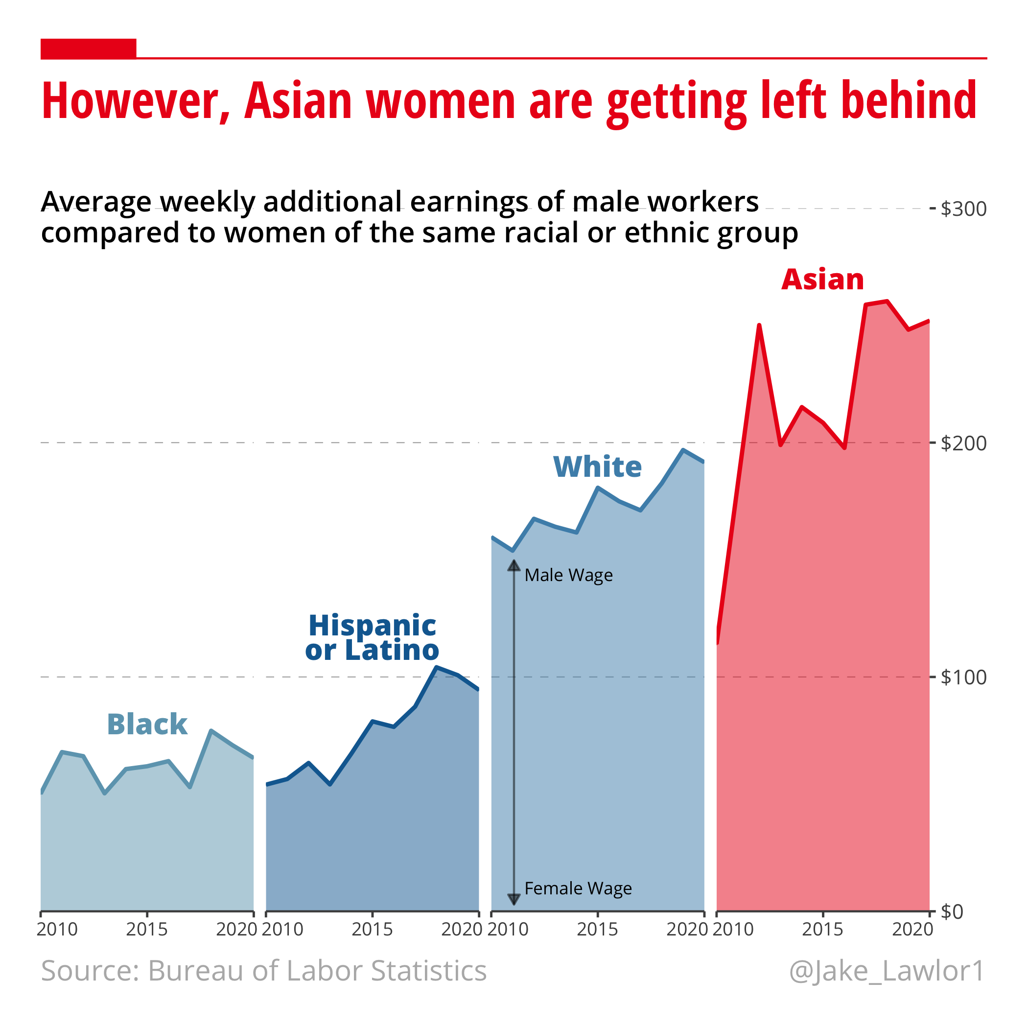
Change in average wages for American workers over one decade – separated by racial and ethic group – using data from the Bureau of Labor Statistics. Here, to practice layout customiztion, I styled these plots to replicate one of my biggest data visualizations, The Economist.
Ratings of Washington Hikes
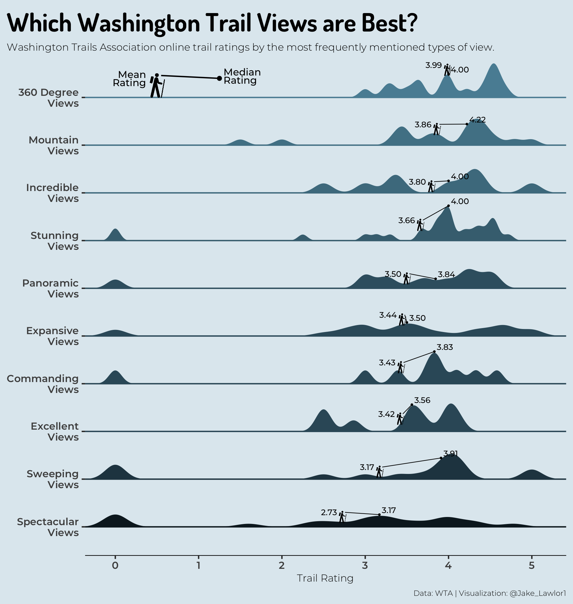
This plot shows the average rating scores of hikes in Washington State from reviews including the 10 most commonly used descriptors of trail views, using data from the Washington Trails Association. Here, I used tidytext to extract instances in which a review included the word “view” or “views”, and recorded the adjective describing the view. I then used ggdist to plot the density spans of scores for reviews using the top 10 adjectives, and ggimage to add icons of hikers hiking across the density rides.
Ring of Fire Volcanoes
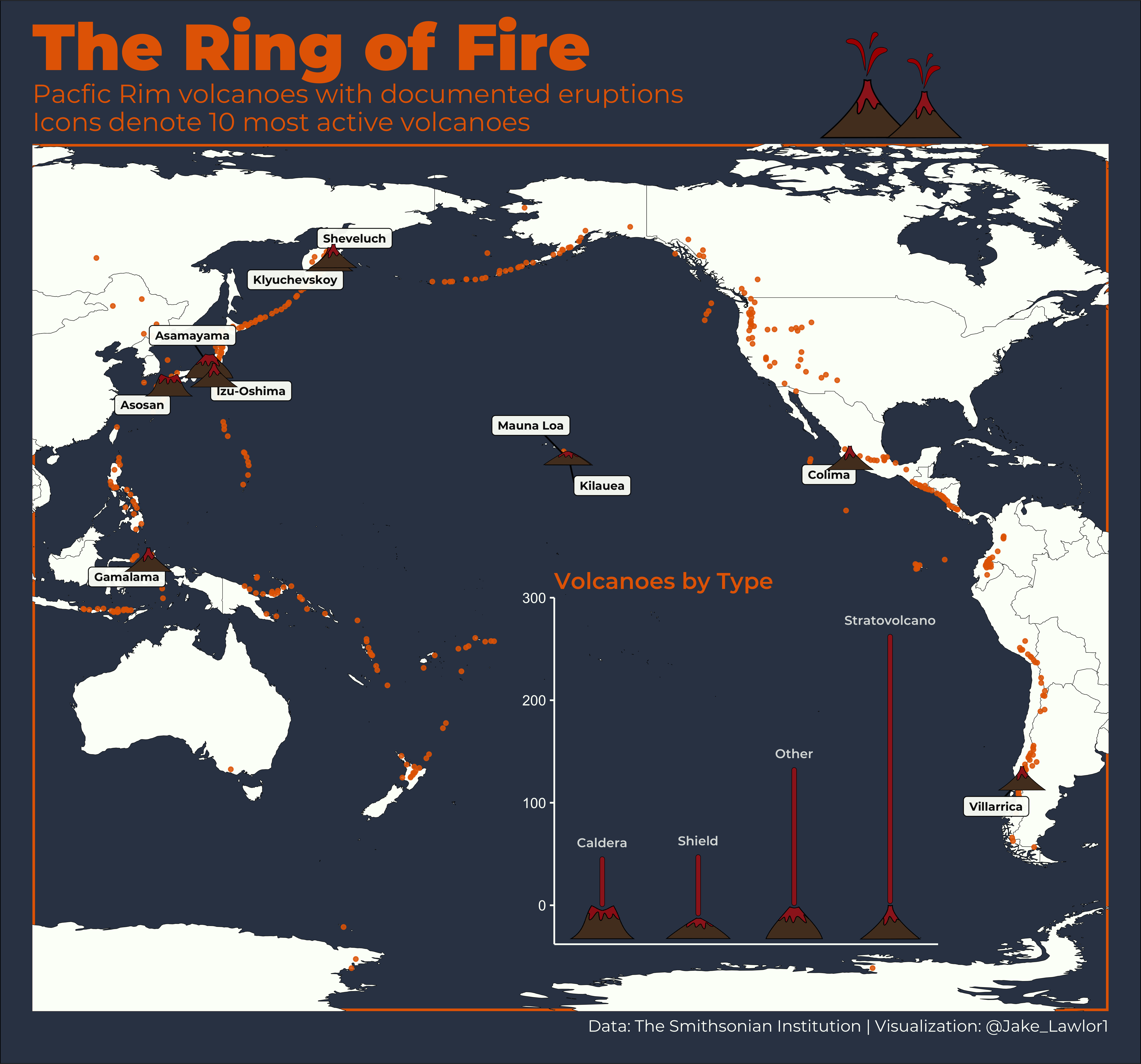
This plot uses rnaturalearth to map the locations of every volcano in the Pacific Ring of Fire, then uses ggimage to plot frequency of each type of volcanoes with custom png graphics that I developed in Inkscape Vector Graphics software.
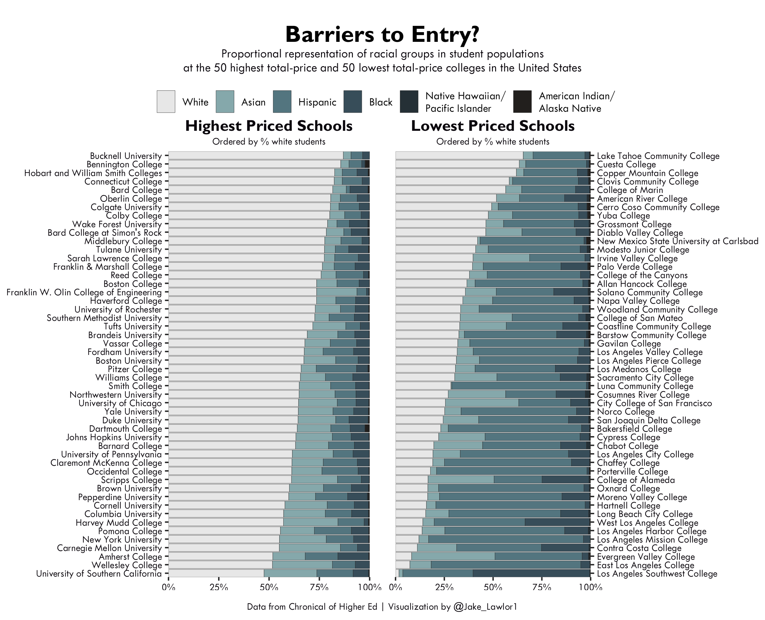
Higher Education Diversity
 Racial composition of the student body population in the 50 highest and 50 lowest total-price colleges and universities, using data from the Chronicle of Higher Education and packages from the
 tidyverse.
Tour de France Winners
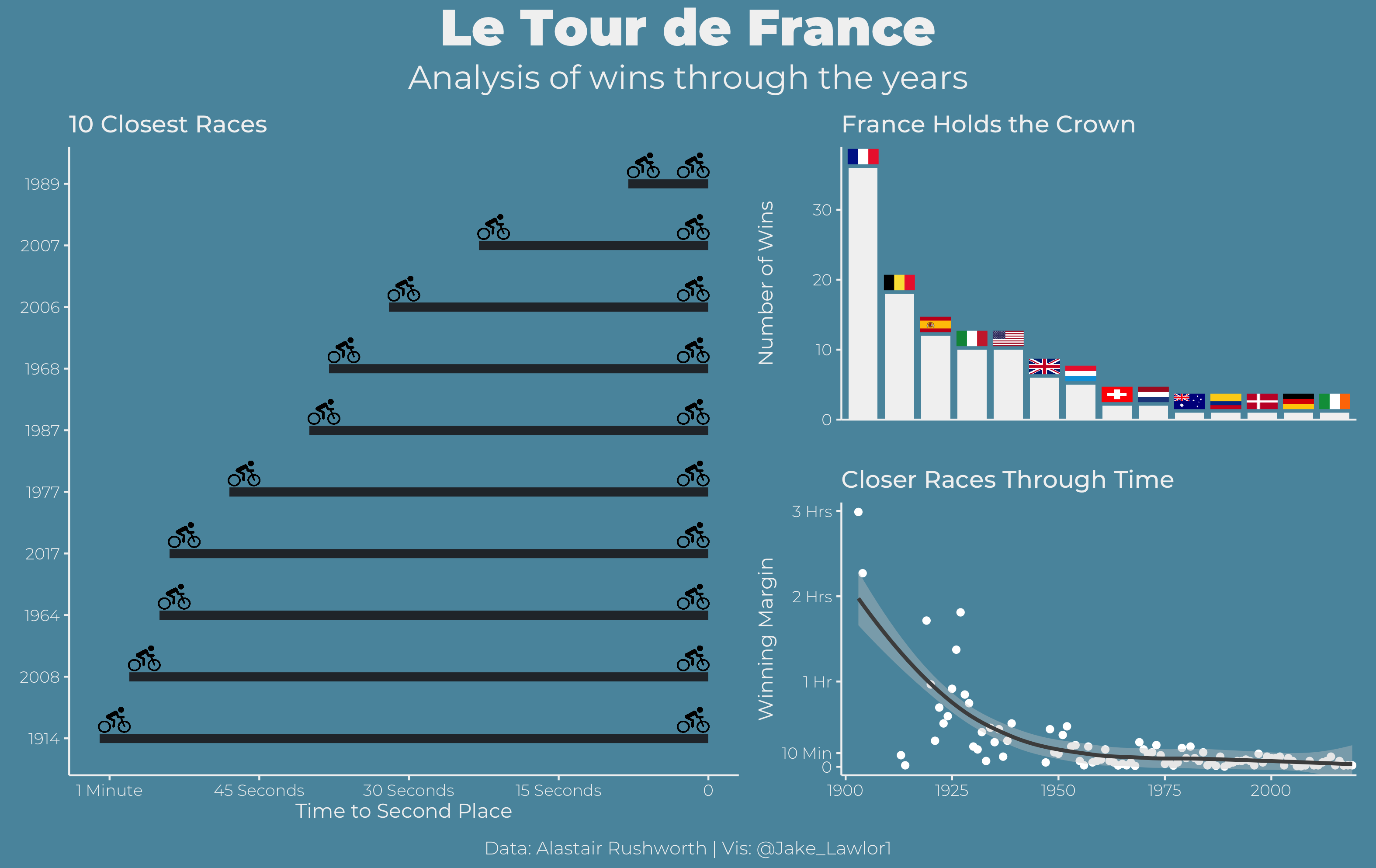
Statistics from ~120 years of Tour de France races. In these plots, I practiced reordering plot factors with the forcats package, and adding png icons to R plots using png and ggimage.
That’s what She Said! (Office Jokes)
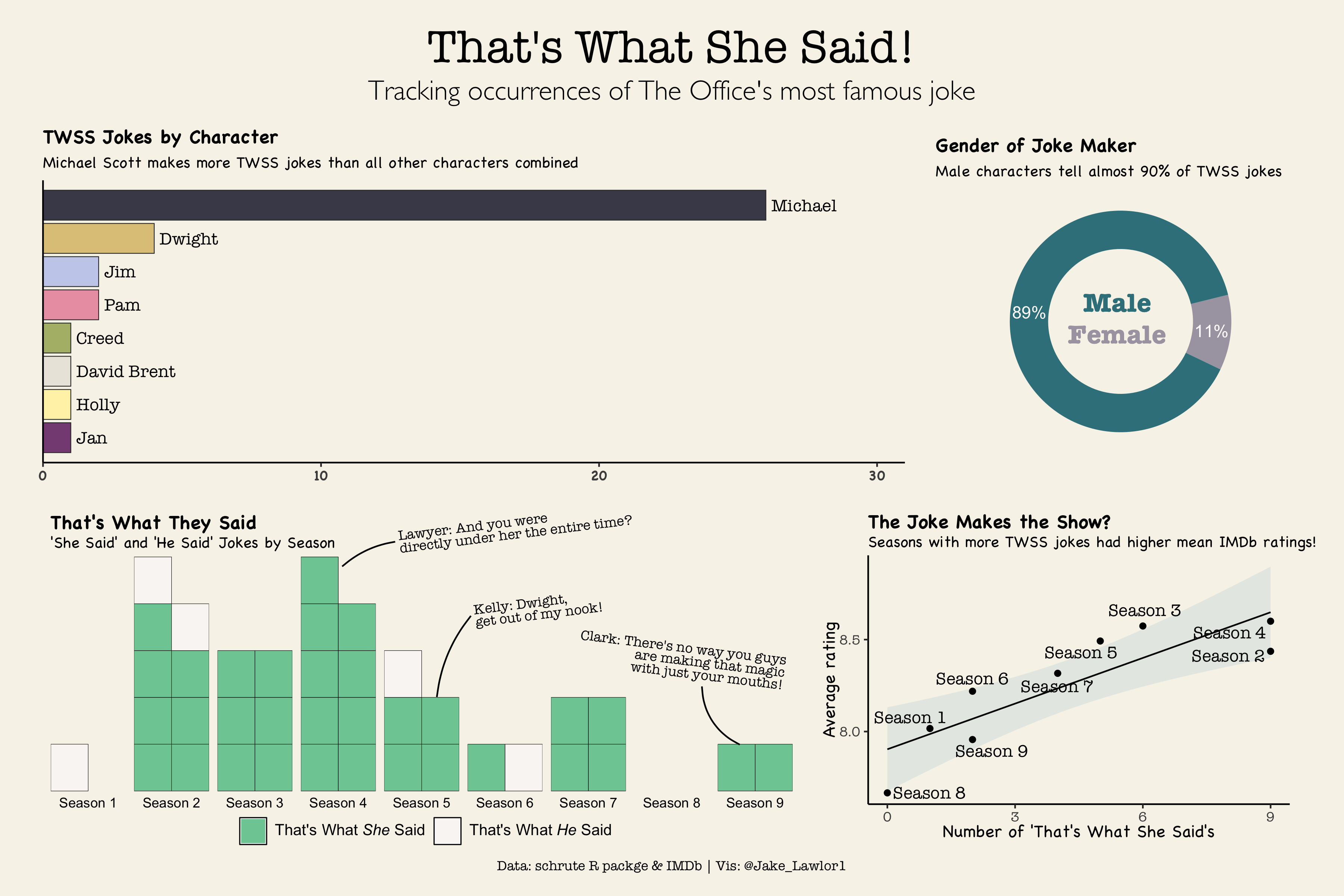
Here, I used text mining with tidytext and stringr on scripts from the TV Show, The Office, provided in the schrute package to create a dashboard of occurrences of the show’s most famous joke.
Measles Rates Over Time
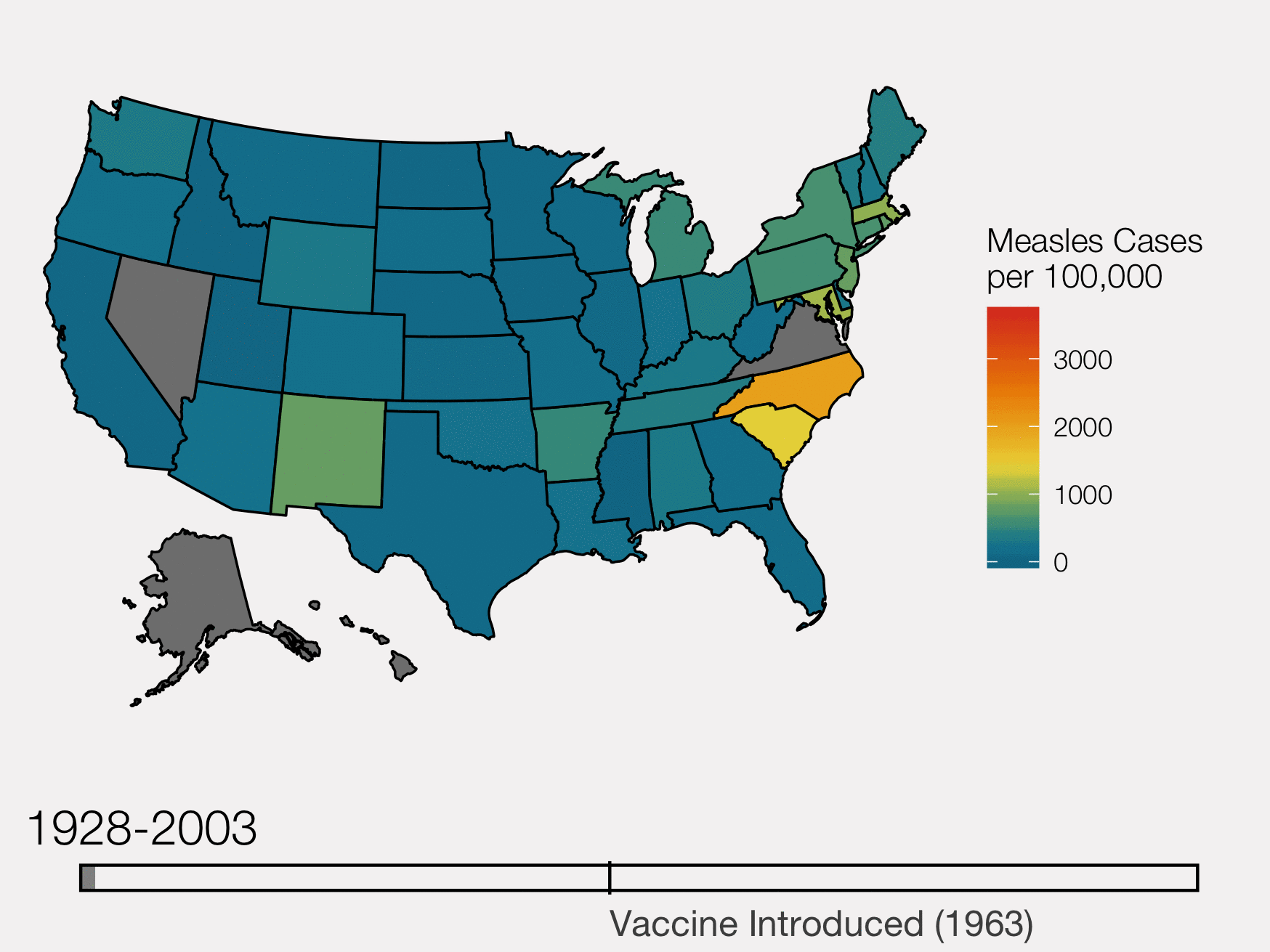
Gif of measles occurrences in US states over time, before and after the intruction of the MMR vaccine.
Password security strength
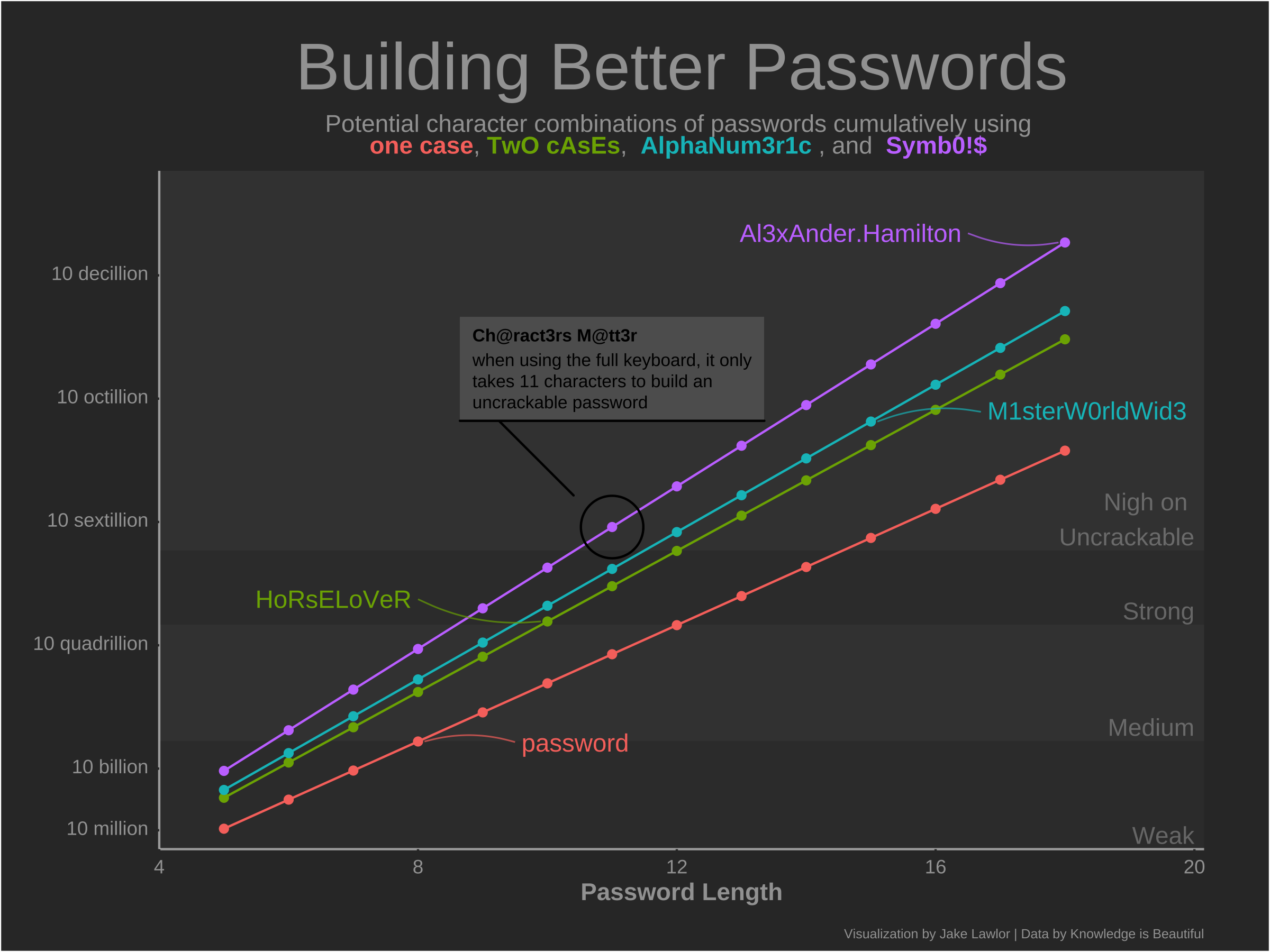
Logistic return of password security strength as a function of character length and the lexicon of characters used (lower case, two cases, alphanumeric, and including symbols).
Shelter Dog Supply Chains
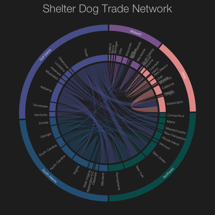
Shelter dog origins versus destinations at Shelters in the United States, with locations grouped by geographical region.
Christmas Songs in the Billboard top 100
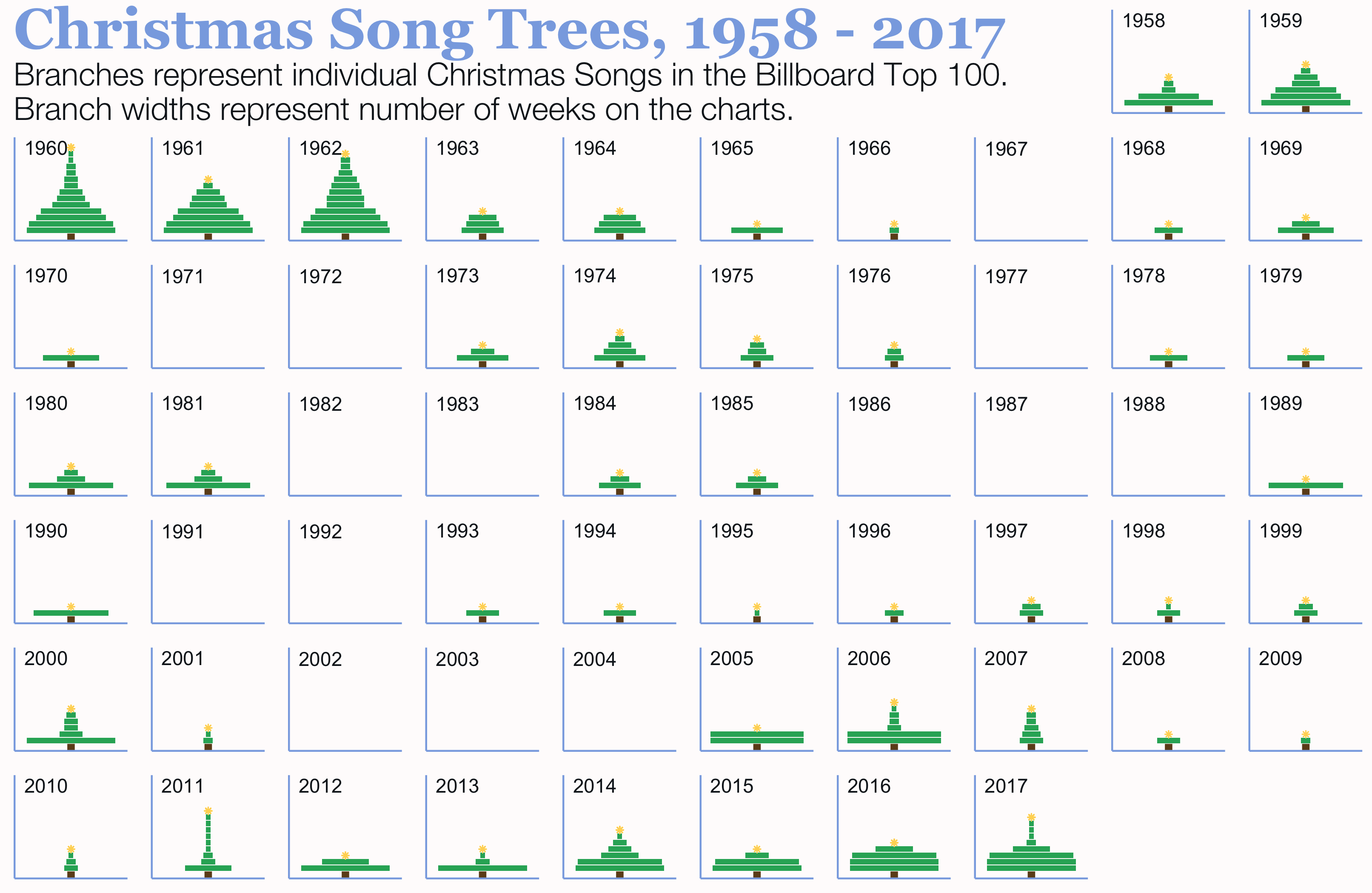
The number and duration of Christmas songs in the Billboard Top 100 from 1958 to 2017. Here, I practiced creating custom geoms to integrate recognizable symbols into data vis.