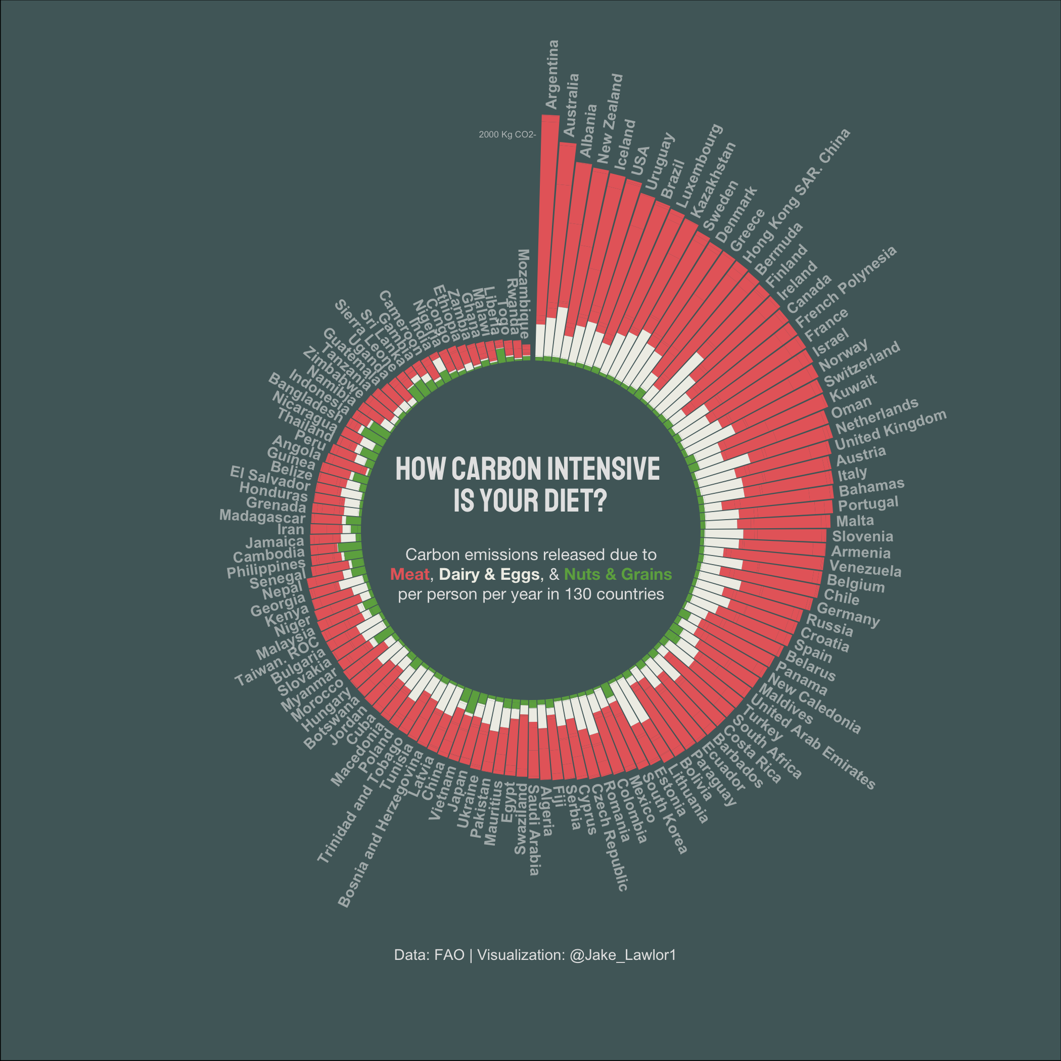
CO2 Output by Diet
This is a visualization I completed as part of the #tidytuesday R social project. This plot uses a polar coordinate system to display carbon emissions from elements of the diets of nearly 180 countries around the world. Code on GitHub link in the banner above.